Unity and iPhone X's Home Indicator
18 October 2018
Check the
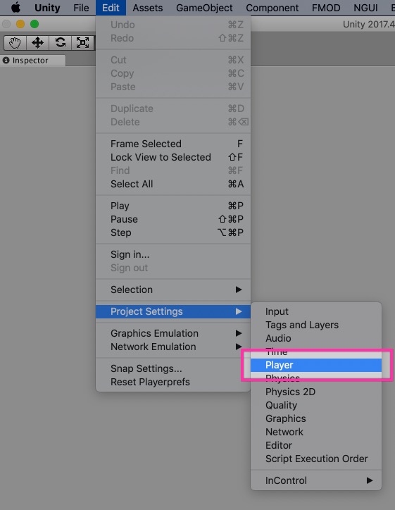
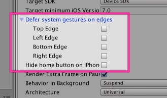
Bottomoption for "Defer system gestures on edges" in theEdit → Project Settings → Playermenu of Unity to make the iPhone X's home indicator less visible and obtrusive in your project.Don't use "Hide home button on iPhone X". This is not what you want for a game.
We are porting Steredenn: Binary Stars to iOS right now, and with the port comes the support for the iPhone X new form factor (yes, it's a bit late, I know…).
When trying the game on an iPhone X, I was not happy with the way the home indicator was always visible, distracting the user while playing Steredenn. I looked at other games and saw that it was possible to change its behavior.
However, it was not really clear how to do that with Unity, so I hope this will help others.
Home indicator?
Since the iPhone X, the mechanism to go back to the home screen has changed on iOS. You have to swipe from the bottom of the screen, which puts the app back inside its icon.
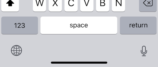
By default, at the bottom (where the chin was), the home indicator is always visible in an app. It's the black bar you can see on this screenshot:

For the moment, it's a permanent indicator if the app does not specify a different behavior.1
See what it does in action:
It's a thoughtful UI that follows the finger precisely. With the haptic feedback, it's actually very nice to play with.
Changing the behavior in Unity
However, this (default) behavior is not great for games. It's too bright and it hides a small portion of the bottom part of the screen. Which can be confusing in games like Steredenn, where many things are displayed at the same time.

Fortunately, Unity (well, technically, it's iOS) provides 2 ways to change the home indicator. Obviously with Unity, the correct one is not the one you would expect.
You can find these settings by following this procedure:
- Go to
Edit → Project Settings → Player.

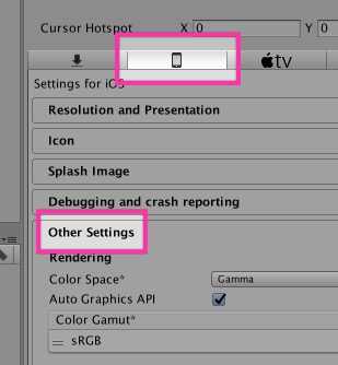
- Then, click on the iOS tab, and find the "Other Settings" area.

- Finally, we are interested in 2 settings: "Hide home button on iPhone X" and "Defer system gestures on edges".

"Hide home button on iPhone X"
"Hide home button on iPhone X", the one that looks like what we want, is, of course, the wrong one.
This setting hides the home indicator after a certain inactivity delay. If the user taps on the screen, the home indicator appears again in its full bright glory. In a game, where you will tap all the time, it's the same as showing the indicator permanently.
Note that this setting can be useful sometimes. For example, if you are doing a video player, or a game that does not require user inputs often, this is what you want. I think there is ways to toggle this behavior when needed.
This is what YouTube does, for example (it's hard to see cos' the home indicator is black here, but look at the bottom):
"Defer system gestures on edges"
As you have guessed now, this is the setting we need.
It does two things:
- The home indicator opacity is reduced, which makes it less bright. Perfect.
- To go back to the home screen, you have to do the gesture twice. This is also nice, since it prevents accidental gestures.
The "bottom" checkbox is enough if you only want to change the home indicator behavior. The other checkboxes can be used for Control Center and other gestures on iPad, I think.
This is what Alto's Adventure does, as well as Steredenn:
-
I think it will be hidden or removed in a future version of iOS when the behavior will be accepted by most people. Currently, it's a nice affordance and the space it takes is necessary while the users are getting used to it.
↩